- Visitor information
- About us
- Exhibitions
- Temporary Exhibitions
- Permanent Exhibitions
- Past Exhibitions
- 2024/2025 - Life with Honey
- 2024/2025 - WANDERINGS - Lili Ország in Kiscell
- 2024 - Light & City
- 2022 - Gábor Gerhes: THE ATLAS
- 2019/2020 - Shine! - Fashion and Glamour
- 2019 - 1971 – Parallel Nonsynchronism
- 2018 – Your Turn!
- 2018 – Still Life
- 2017 – LAMP!
- 2017 – Tamás Zankó
- 2017 – Separate Ways
- 2017 – Giovanni Hajnal
- 2017 – Image Schema
- 2017 – Miklós Szüts
- 2016 – "Notes: Wartime"
- 2016 – #moszkvater
- 2015 – Corpse in the Basket-Trunk
- 2015 – PAPERwork
- 2015 – Doll Exhibition
- 2014 – Budapest Opera House
- 2013 – Wrap Art
- 2012 – Street Fashion Museum
- 2012 – Riding the Waves
- 2012 – Buda–Pest Horizon
- 2011 – The Modern Flat, 1960
- 2010 – FreeCikli
- 2008 – Drawing Lecture on the Roof
- 2008 – Fashion and Tradition
- 2004 – Mariazell and Hungary
- Virtual museum
- What's happening?
The interior architecture and furnishings of Hotel Gellért
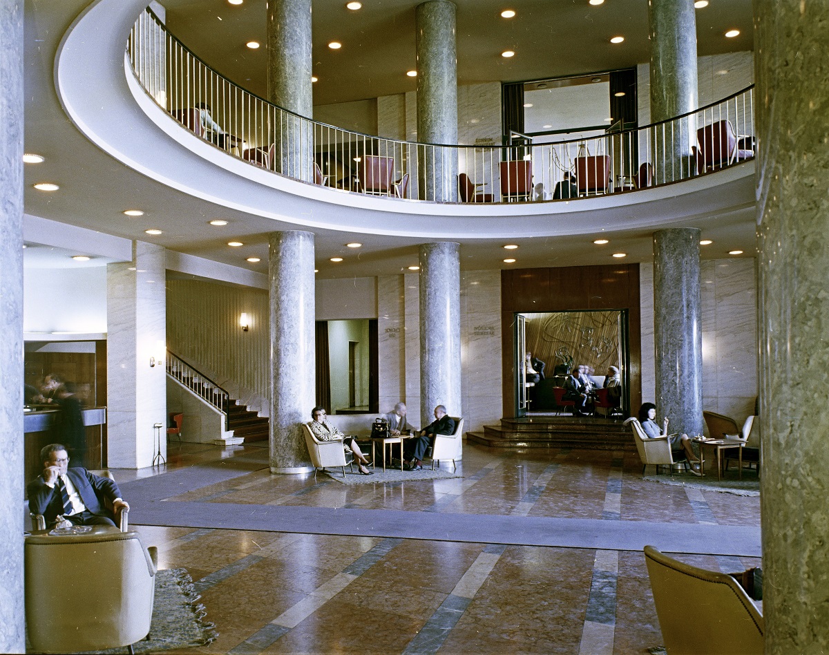
The interior architecture and furnishings of Hotel Gellért
1114 Budapest, Szent Gellért tér 2.
The lobby and the staircase lobbies were designed by János Flach (KÖZTI), assisted by Frigyes Gábriel, József Weiszer, Margit Potyondi (Mrs. Lajos Csonka), Edit Lőrinczi (Mrs. Marcell Kisszebeni)
The individual rooms were designed by Júlia Gaubek, József Király and Gábor Papp
Applied works of art by István Bán, Anna Bozsóki, Jolán Fett, István Gádor, Géza Gorka, Zsuzsa Gulás, Ibolya Juris, János Percz, Éva Szabó, Katalin Takács
Planning: 1958–60, construction: 1959–61
Documentation: November 2021 (cca. 250 photos)
Photos: Judit F. Szalatnyay, concept: Márta Branczik, contributor: Csaba Gál
Contemporary sources:
Flach, János: A Gellért szálló reprezentációs helyiségei. [Representative rooms of Hotel Gellért.] Magyar Építőművészet, 1959/5-6., pp. 190–191.
Molnár, László: A Gellért Szálló új berendezése. [The new interiors of Hotel Gellért.] Művészet, October 1960, Vol. 3., pp. 24–26.
Borbíró, Tamás: A helyreállított Gellért szálló reprezentatív helyiségei. [Representative rooms of the reconstructed Hotel Gellért.] Magyar Építőművészet, 1961/2., pp. 14–18.
Hotel Gellért was built during the First World War, and was in its heyday in the 1920s and 30s, but its interior design was revived in the 1960s, making it the subject of our research. During the Second World War, the hotel was extensively damaged inside and out, and there was talk of rebuilding it with a completely altered, modern exterior rather than renovating it, but this was never realised.
By 1946, some rooms had been renovated and the first guests arrived. But the really significant renovation, which also affected the communal areas and was intended to turn the former conservative and elegant hotel into a modern hotel that met the new requirements, began in the 1950s and was only fully completed in 1961, with Zoltán Kósa as the architect. The interior design was led by János Flach, a colleague of KÖZTI, the state building office responsible for the most important public buildings. Kósa, who later won the Ybl Prize for his work in the hotel, had worked on the furniture designs for Rákosi's office in the Buda Castle a few years earlier.
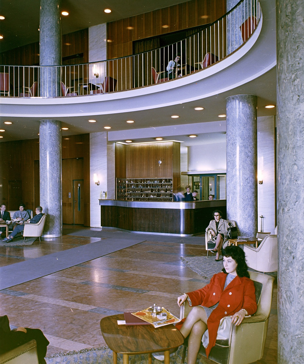
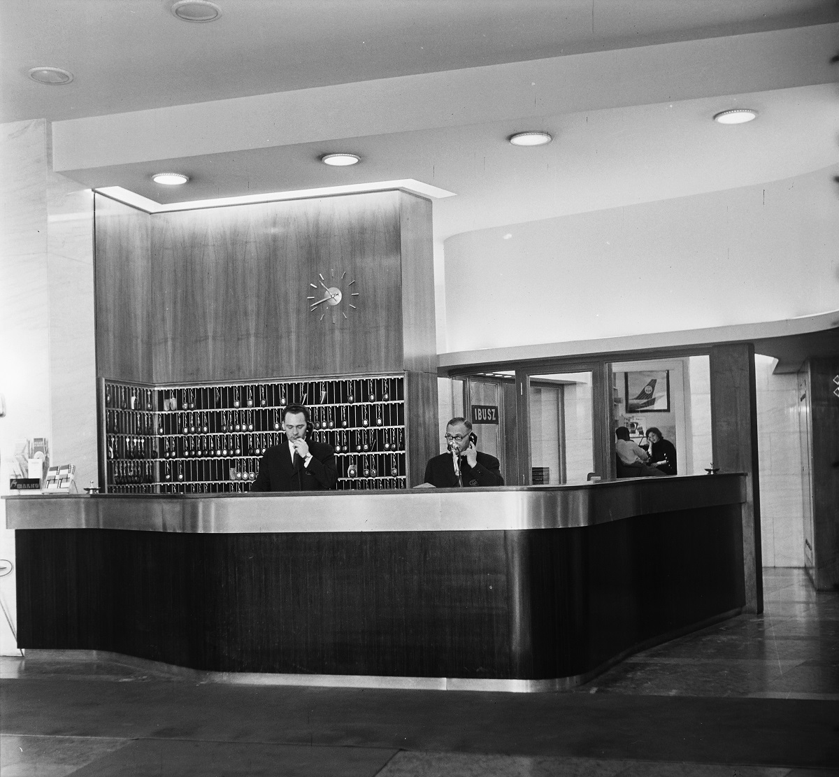
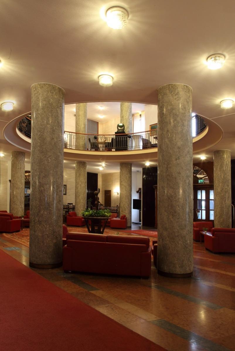
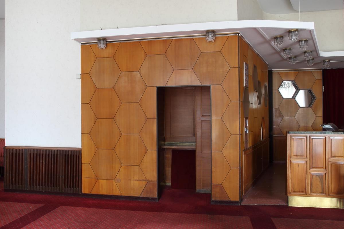
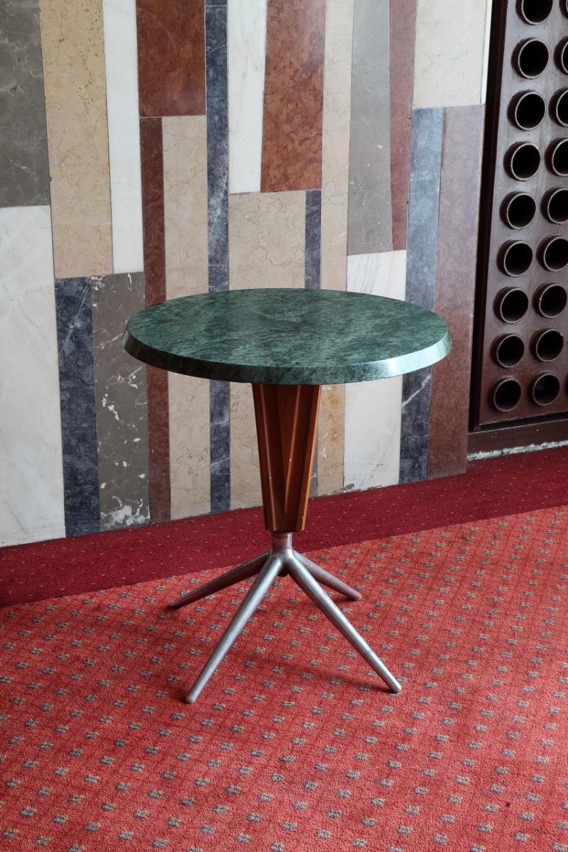
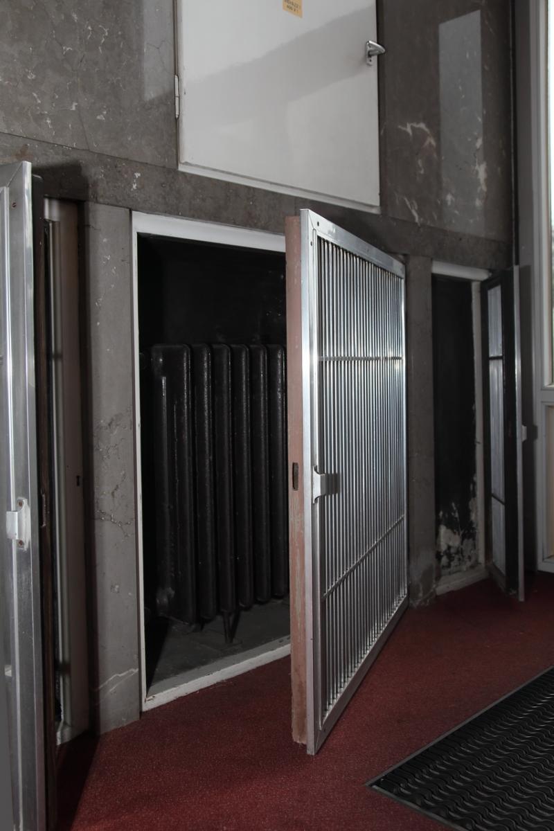
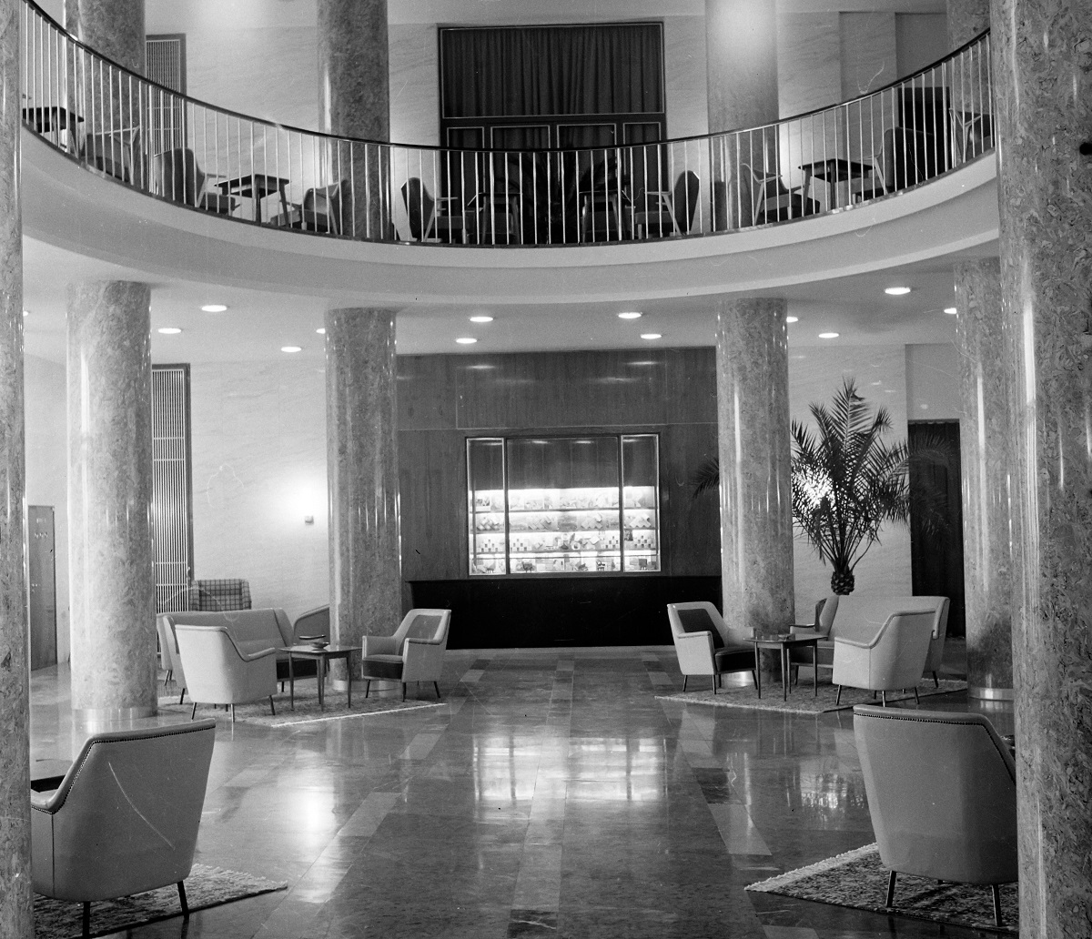
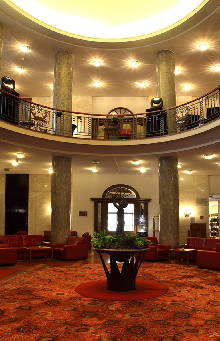
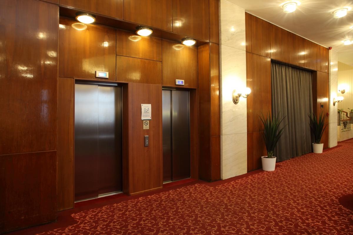
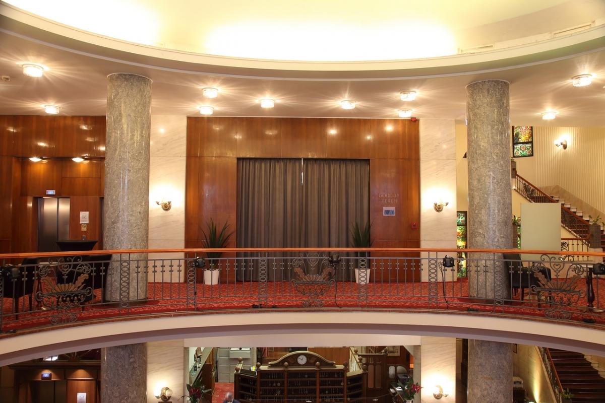
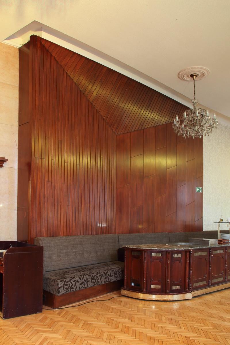
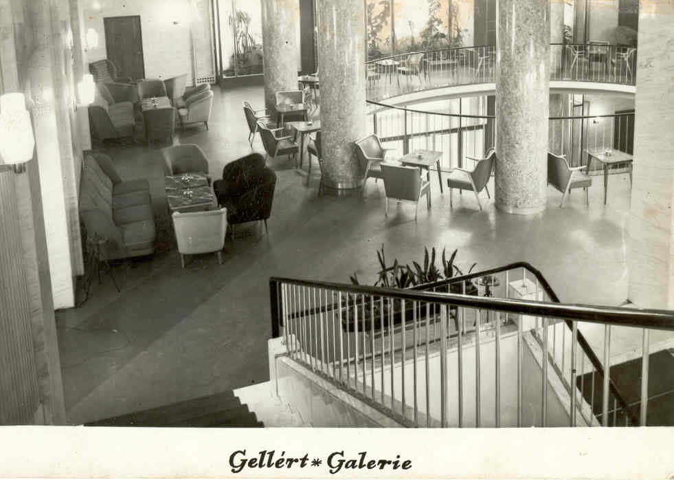
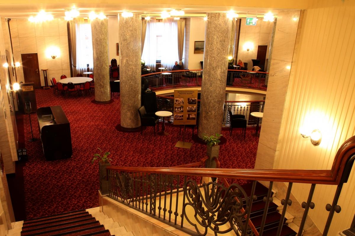
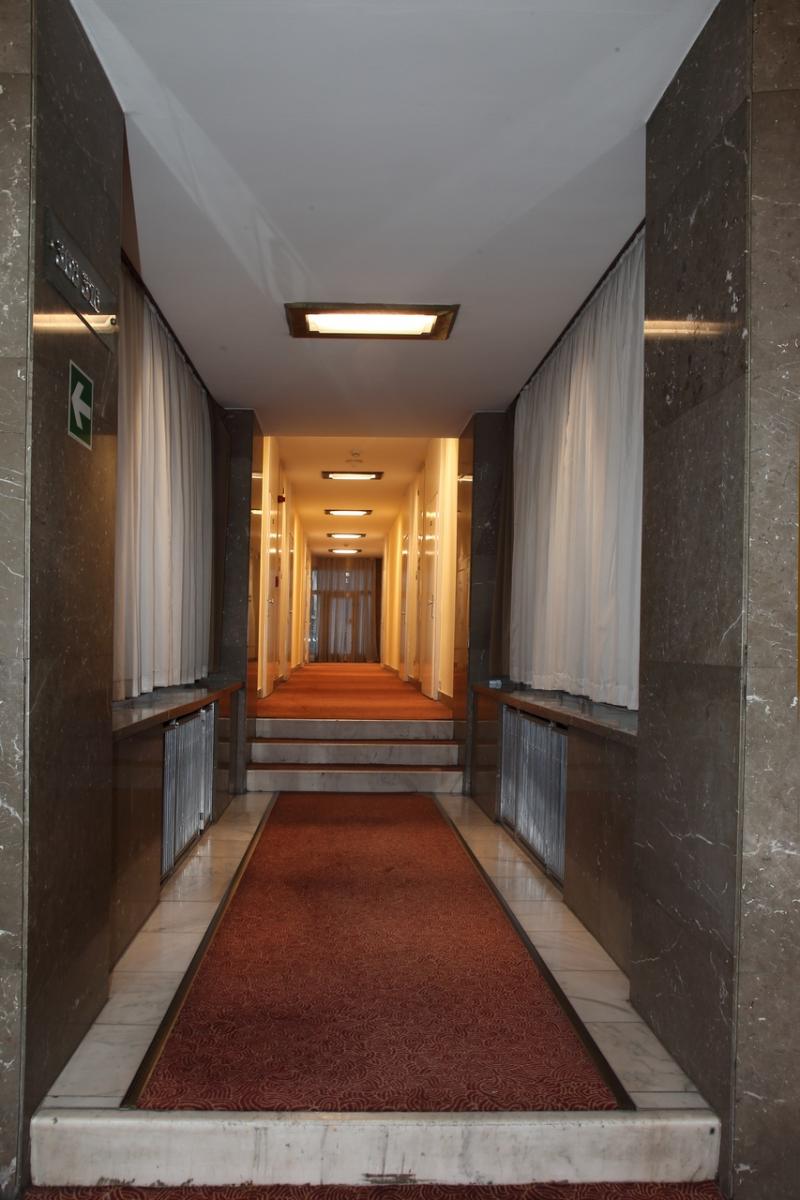
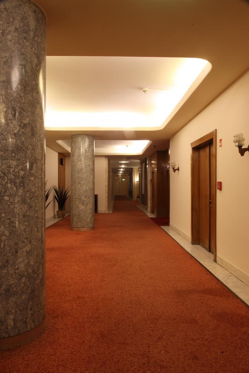
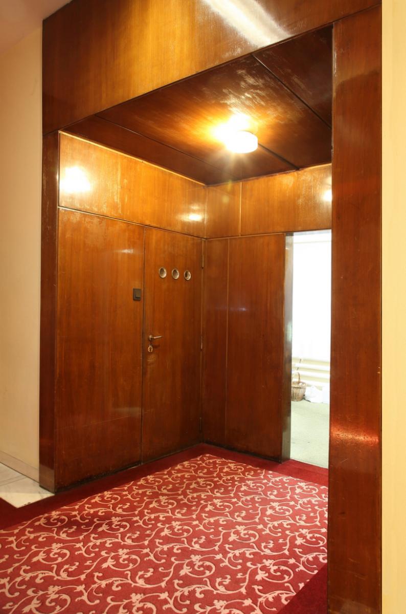
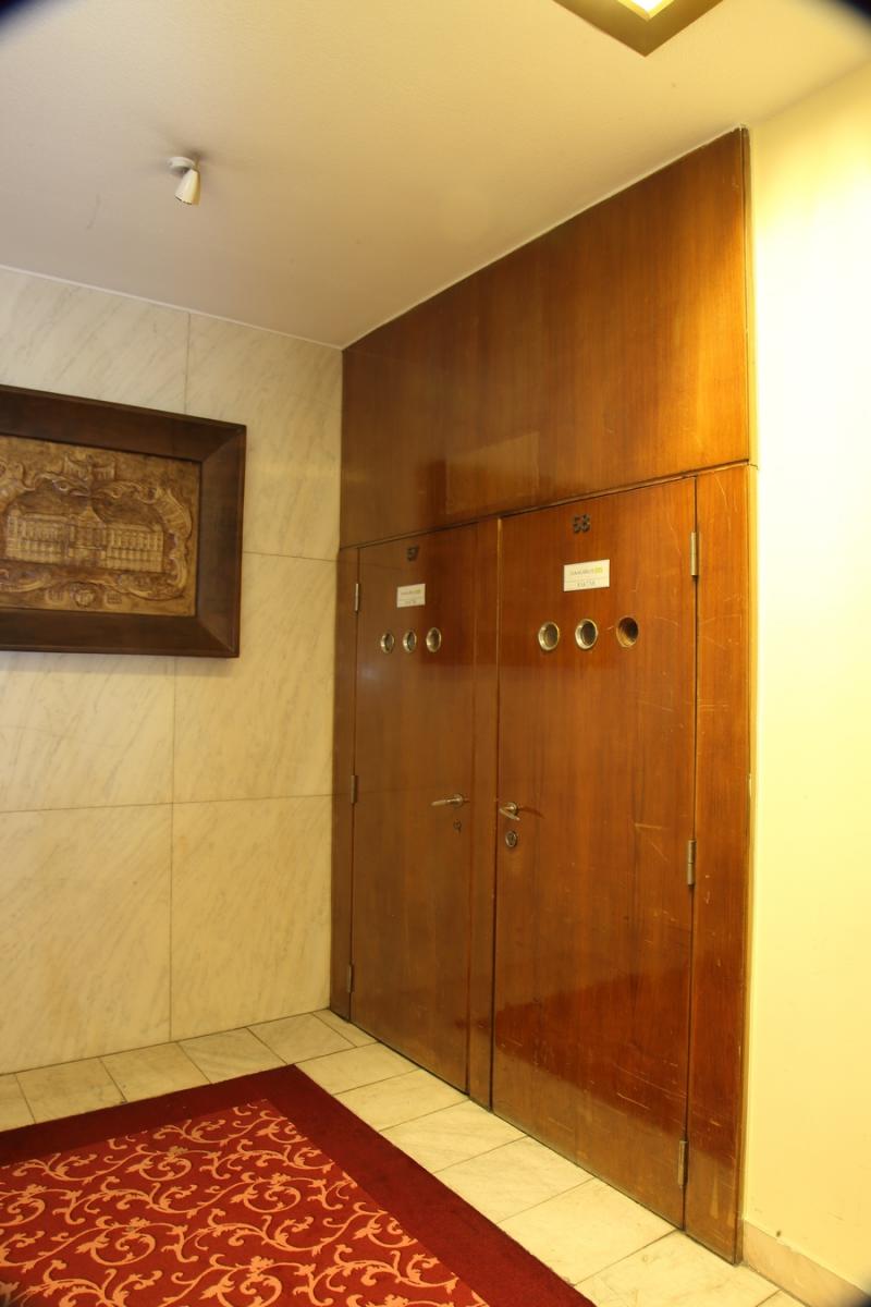
The interior design concept preserved the hotel's previous spatial structure. The two-storey lobby with representative restaurants on the left and right side of the Danube was kept, although the size and layout of the restaurants has changed. Of course, it was not only their size that reflected the new era, but also their style. The imposing foyer had smooth-trunked columns with elaborate faux marbling, simple stick railing, limestone floors and walls of beautifully veined light marble. In addition to the cooler stone claddings, the surroundings of the entrances and elevator doors were and still are covered with warm-toned wood panelling (sometimes, unfortunately, spoiled by terrible touch-ups). All the panelling, even the chrome trellis covering the radiators, covered the entire ceiling height, thus visually enhancing the interior. The designers also took care to ensure that the distribution of the tiles was in perfect harmony with the height of the openings.
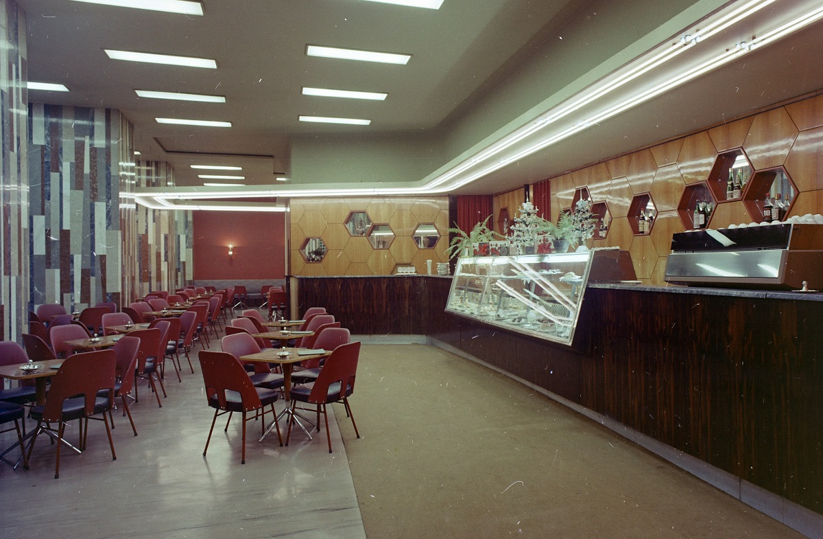
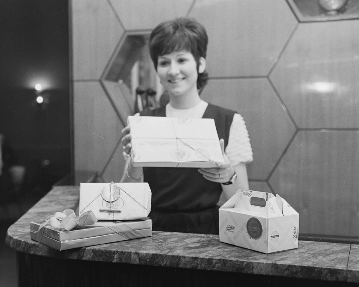
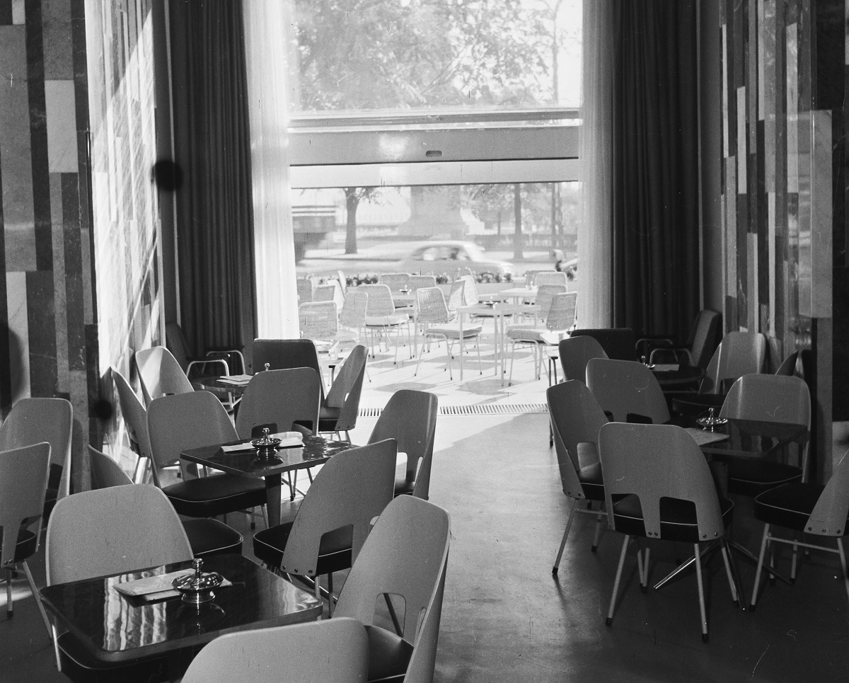
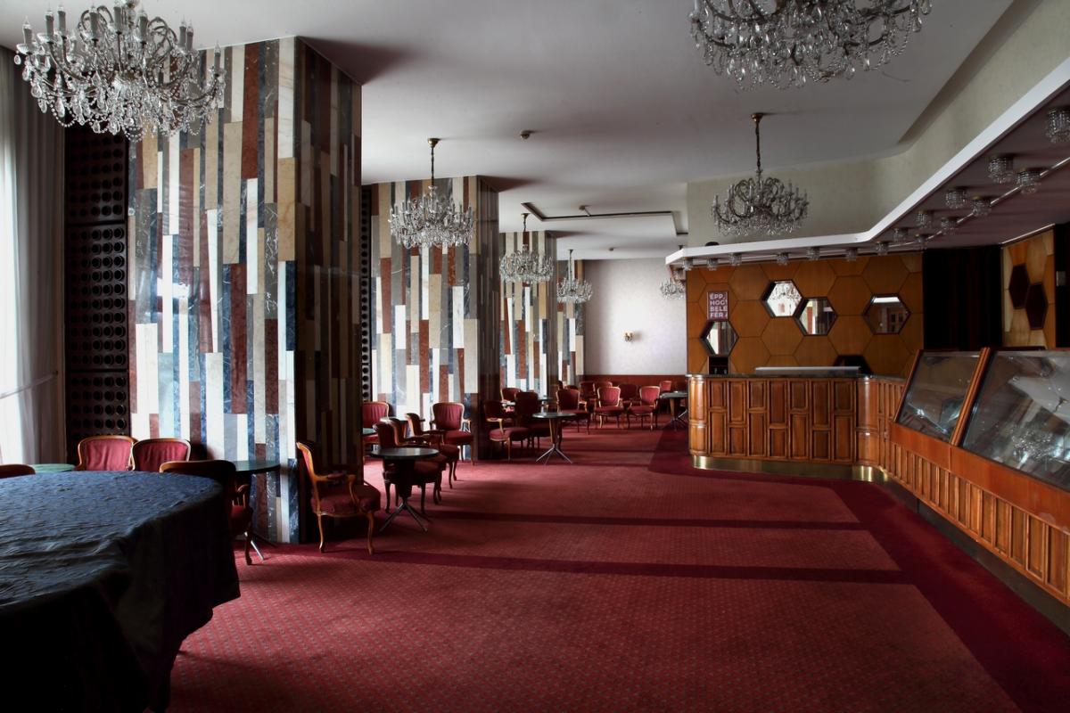
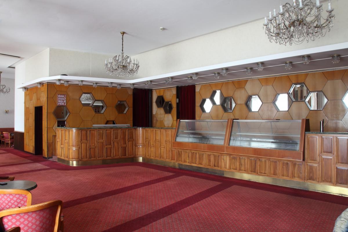
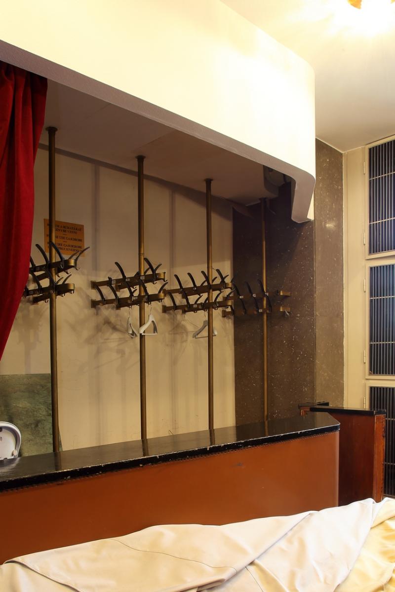
To the left of the foyer, through a small cloakroom lobby, was the entrance to the Confectionery. The space was dominated by unusual pillars with stone banding of varying widths and colours, polygonal wall panelling of light wood panels, a dark-toned counter covered in walnut and light grey linoleum (rubber, PVC?). Not to mention the extravagant furnishings and dynamic neon lighting panel. It's interesting how much of this has survived the years, despite the rococo-ish refurbishing.
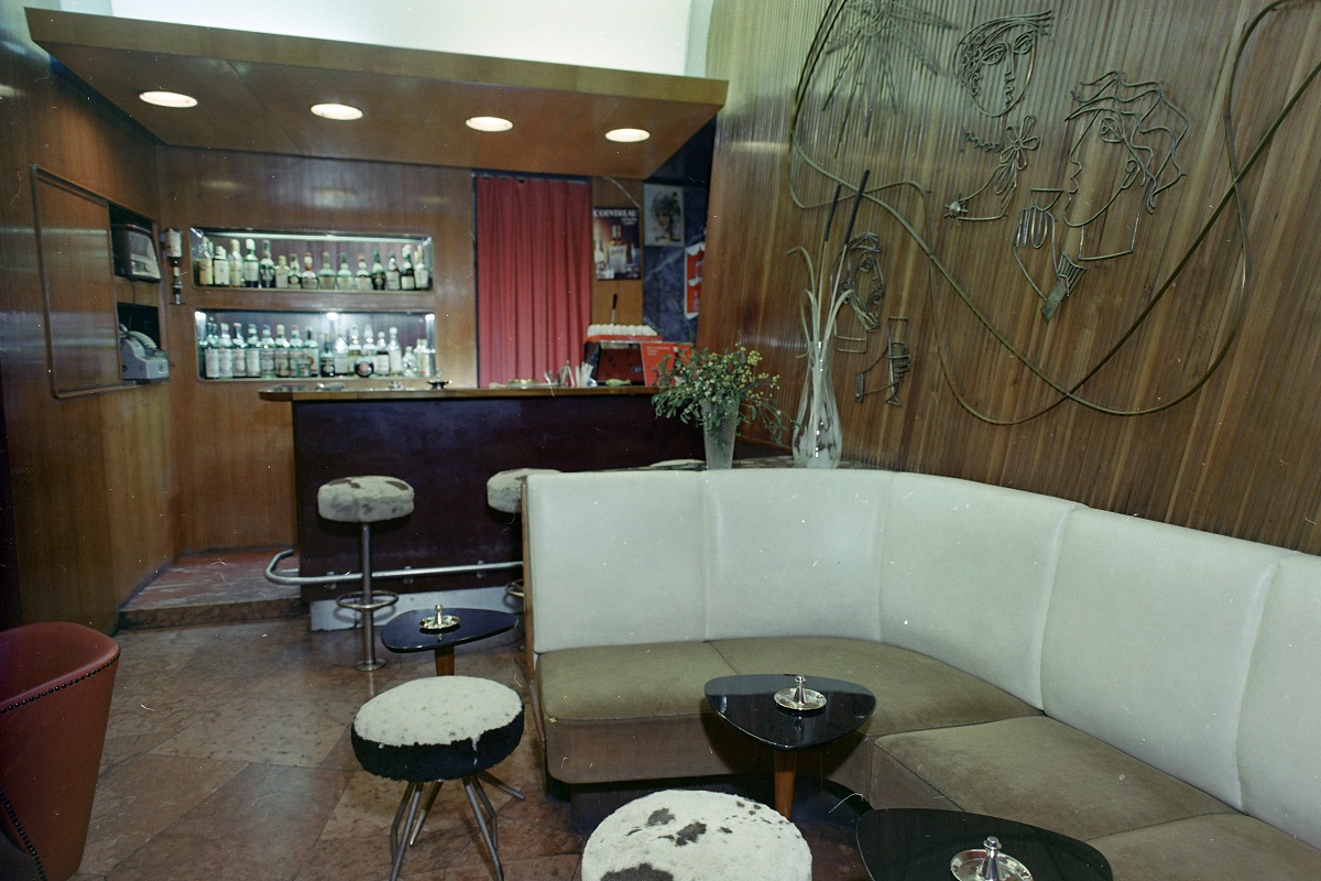
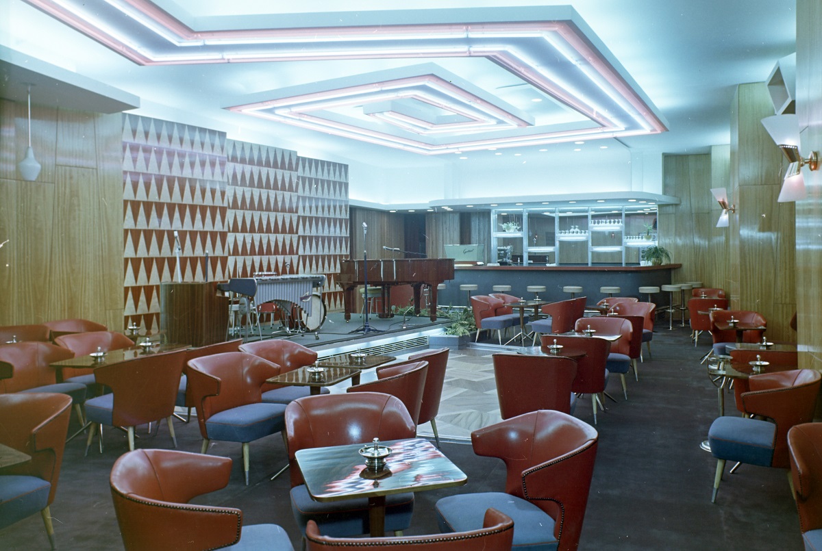
On the other side of the foyer, an exciting little bar (a so-called Drinking Room) opened up, with a metal sculpture by János Percz applied to the lathing on the wall. Behind it, a larger bar with live music and dancing, designed for almost a hundred people, was located. We don't know who designed it, but the variety of colours and materials, with the neon accents, is unlike the elegant modernity of the other rooms or the lobby. The bar is joined to the largest dining area, the restaurant, which seats 150 people, on the Kelenhegyi Road side of the building. Its original interior design and furniture are not known.
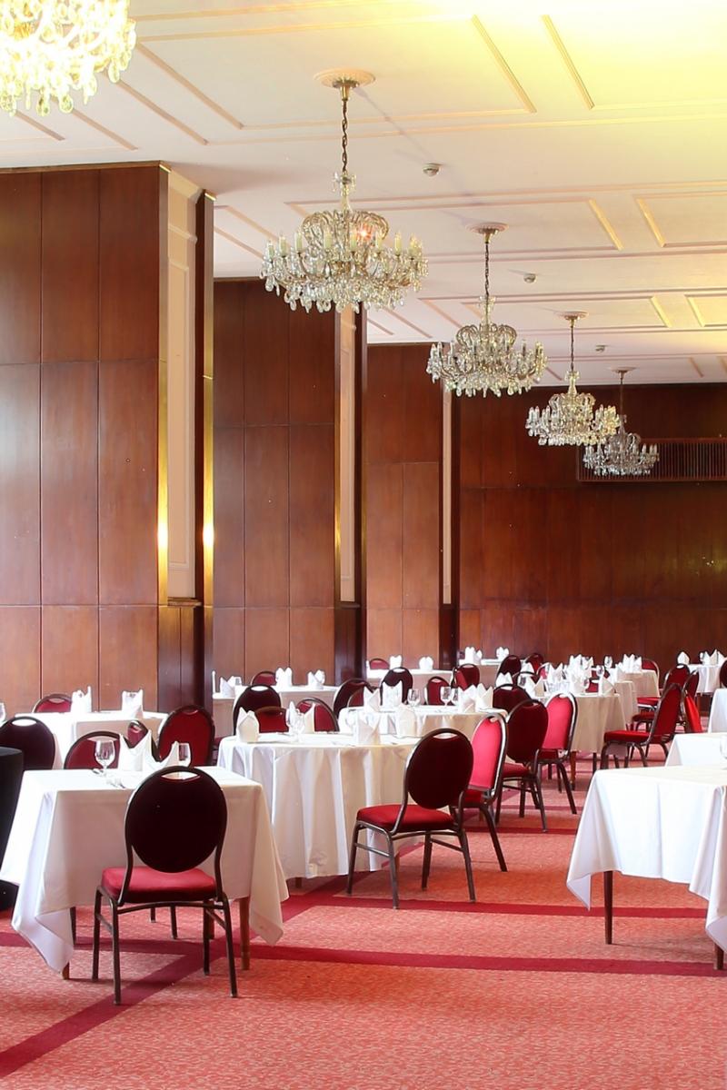
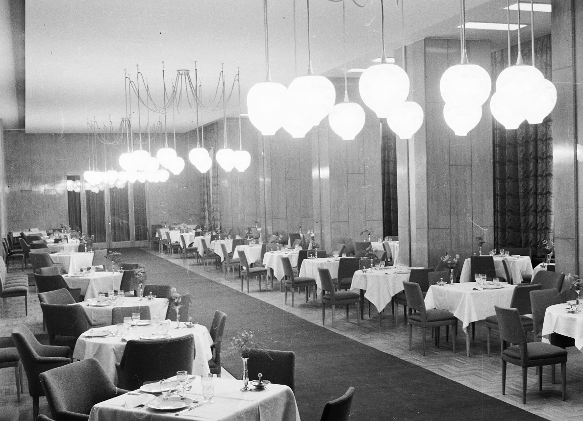
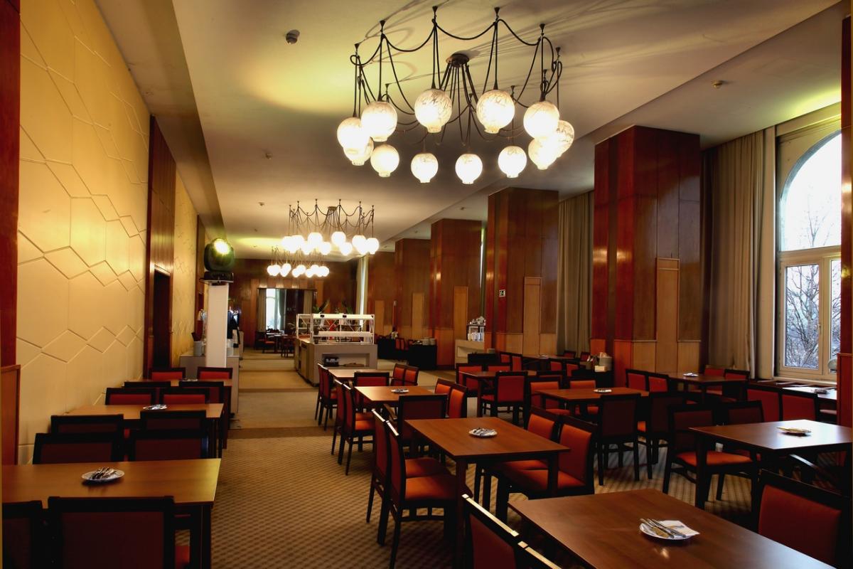
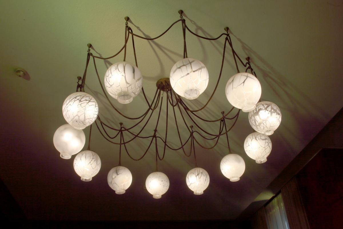
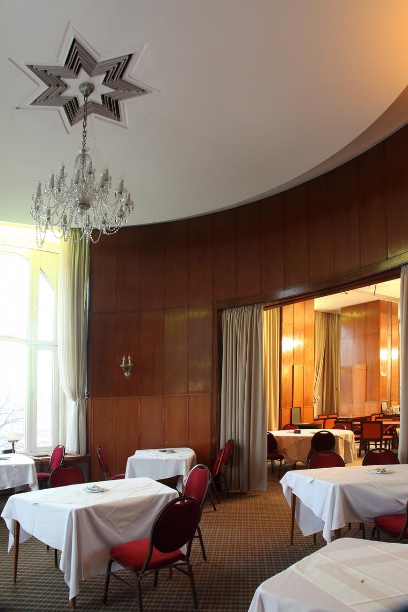
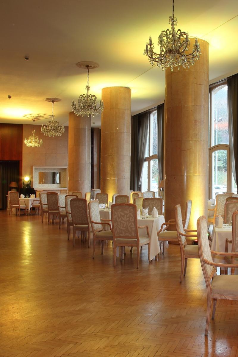
Other representative spaces of the hotel were accessible from the gallery level of the lobby. On the Danube side was the so-called Tea Salon on the left, and on the right the Danube Restaurant, whose geometric wall panelling and fantastic "string" chandeliers are still in place today. Behind it, a small circular room with wood panelling and art deco stucco ceilings. Then, towards Kelenhegyi Road, another large restaurant, paved with light-coloured stone (perhaps Ruskica marble?), with huge columns with plain trunks. Surprisingly, there is no contemporary photograph available of this space either.
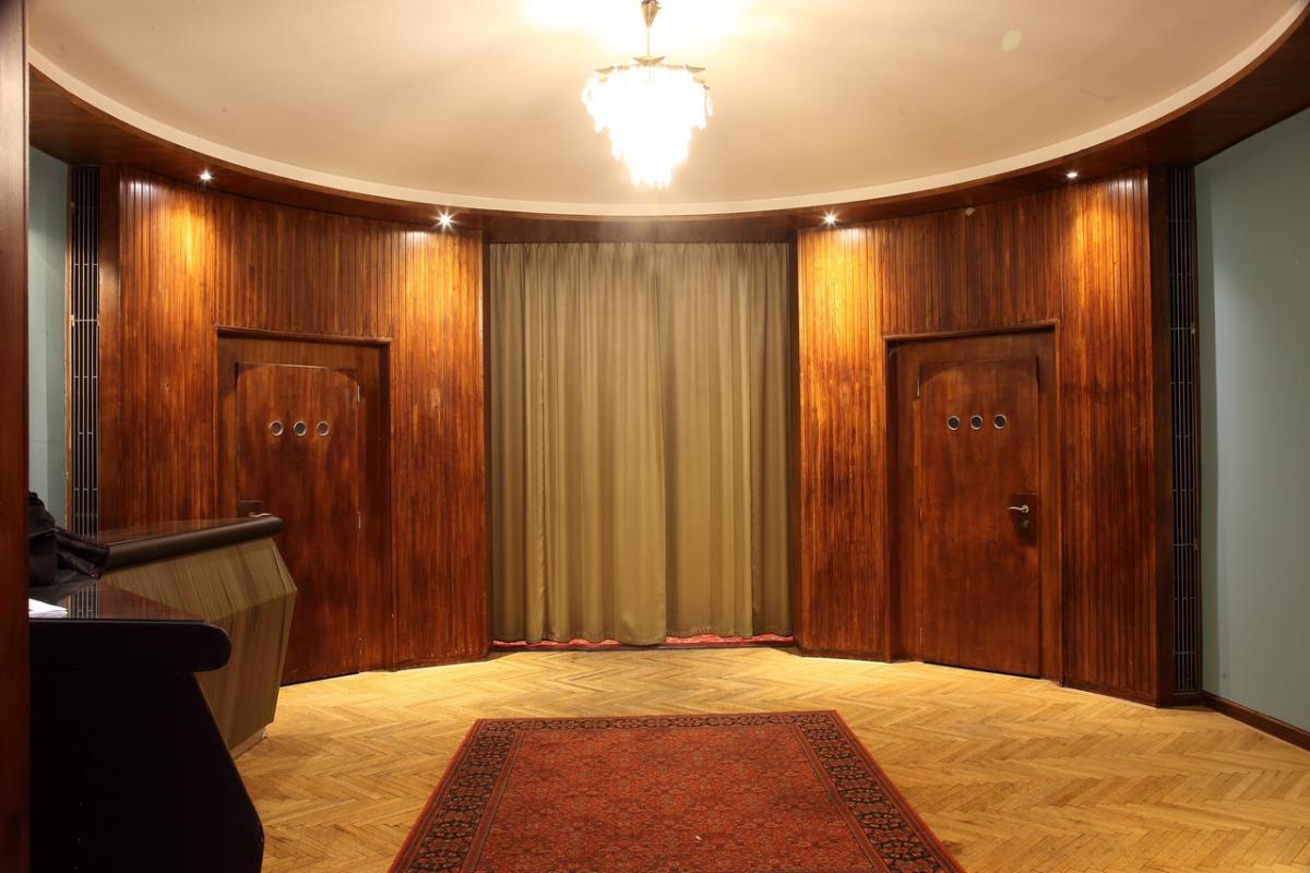
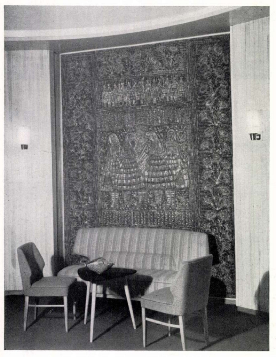
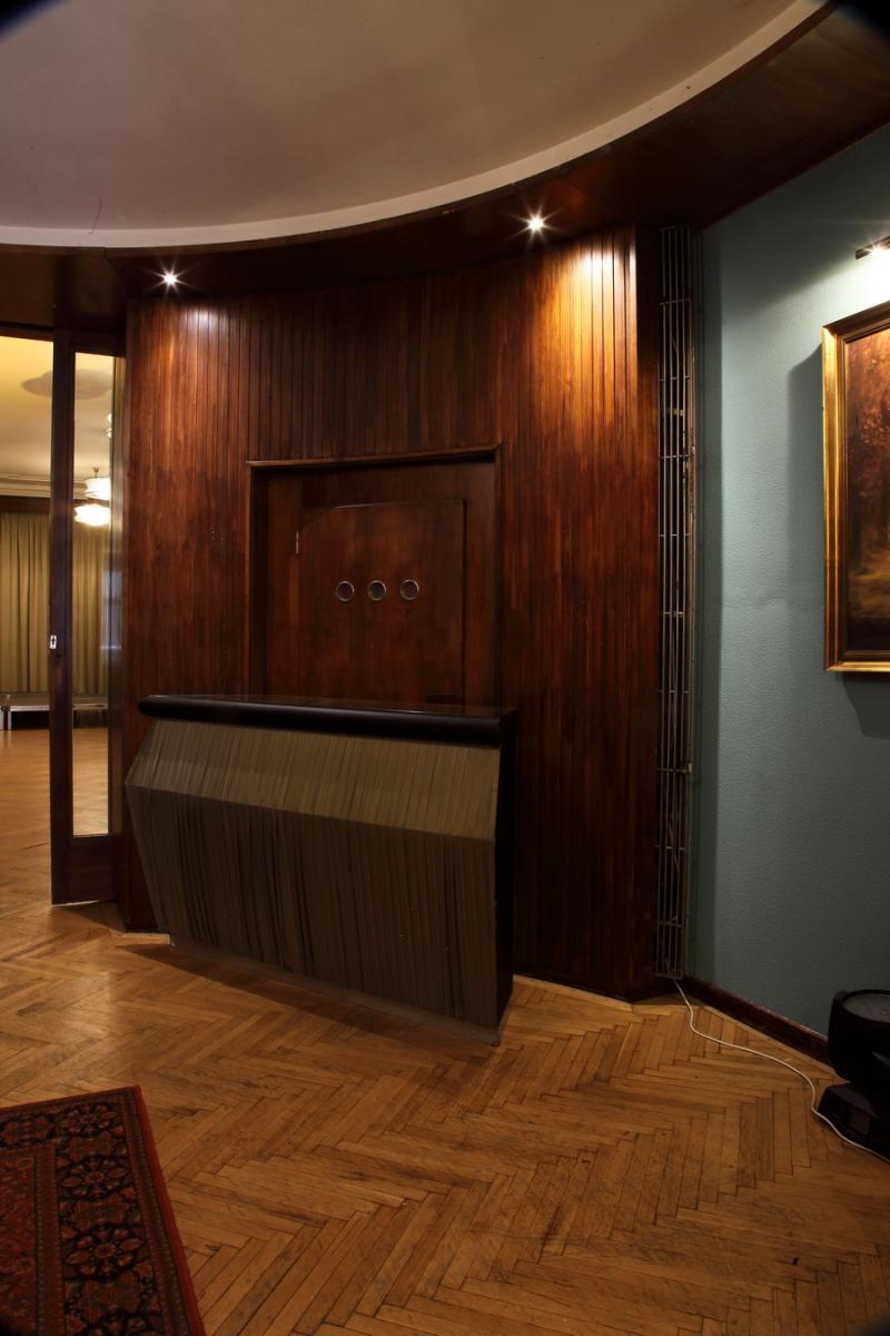
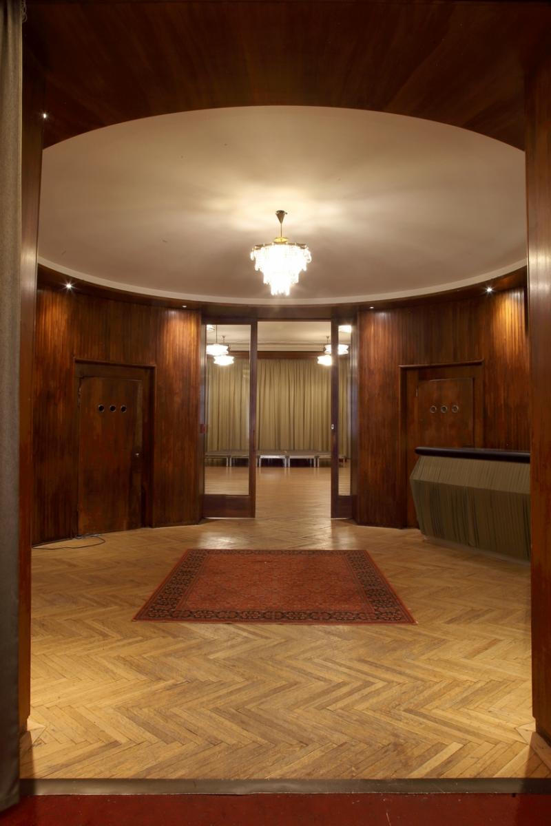
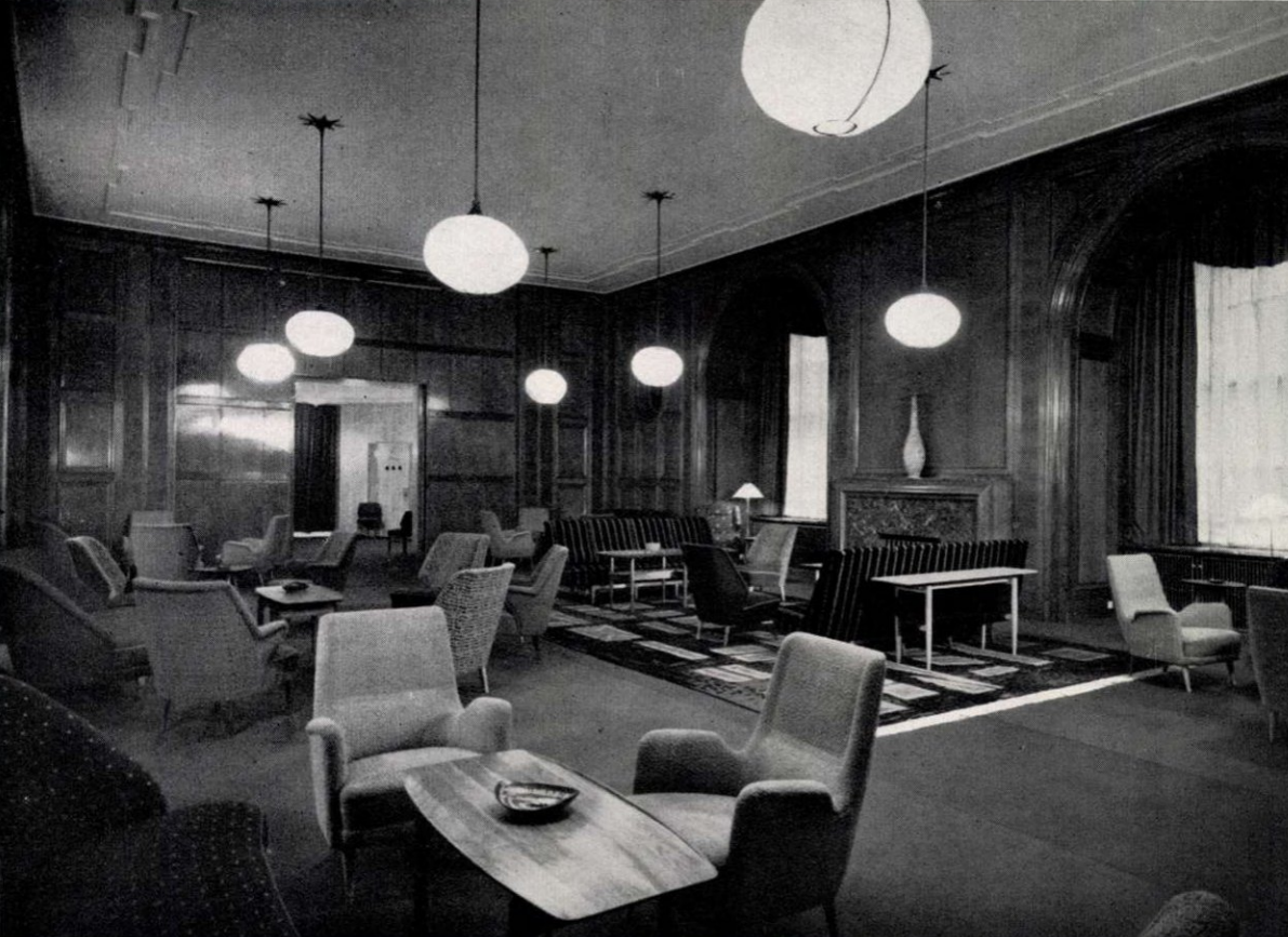
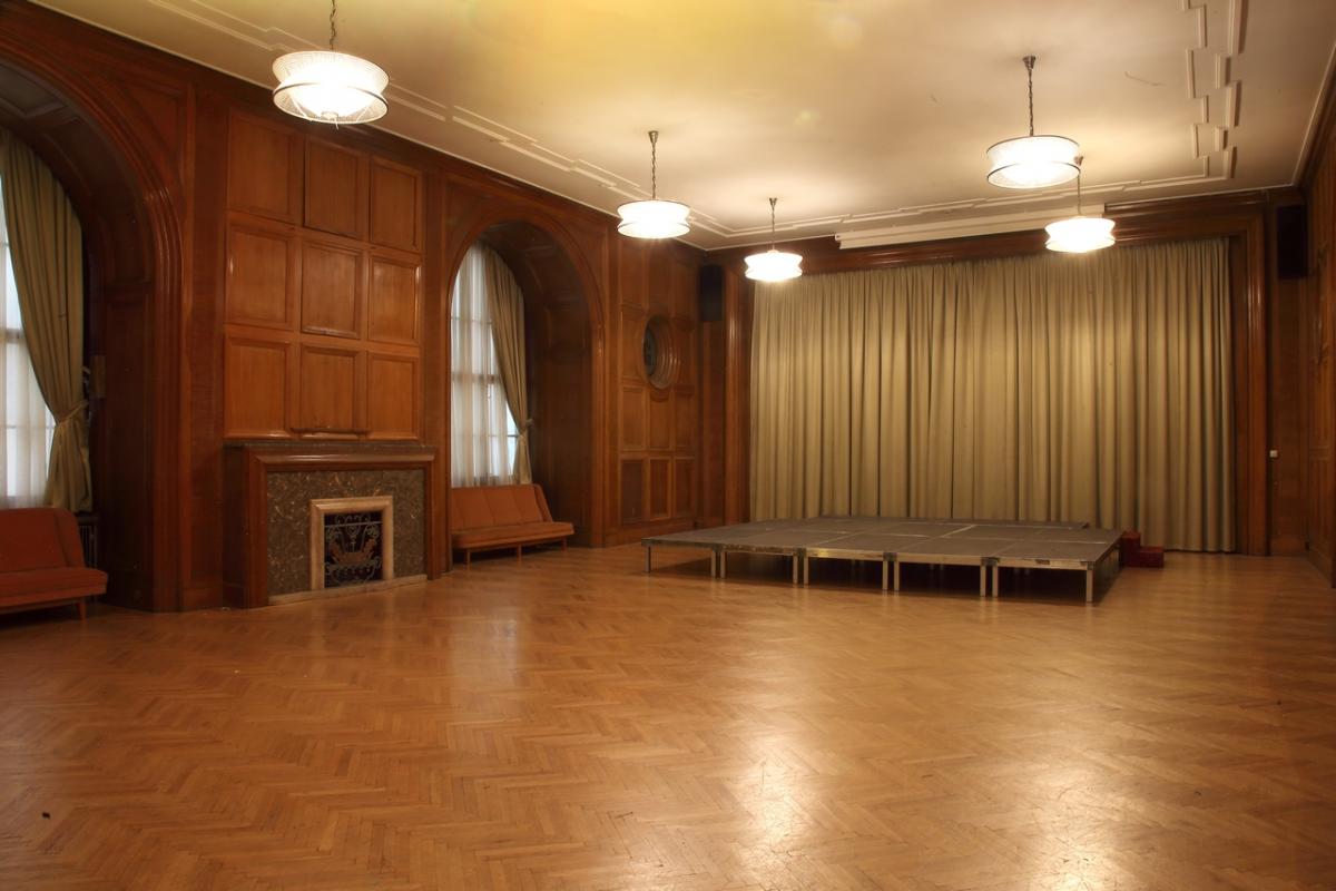
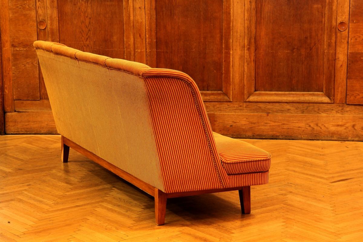
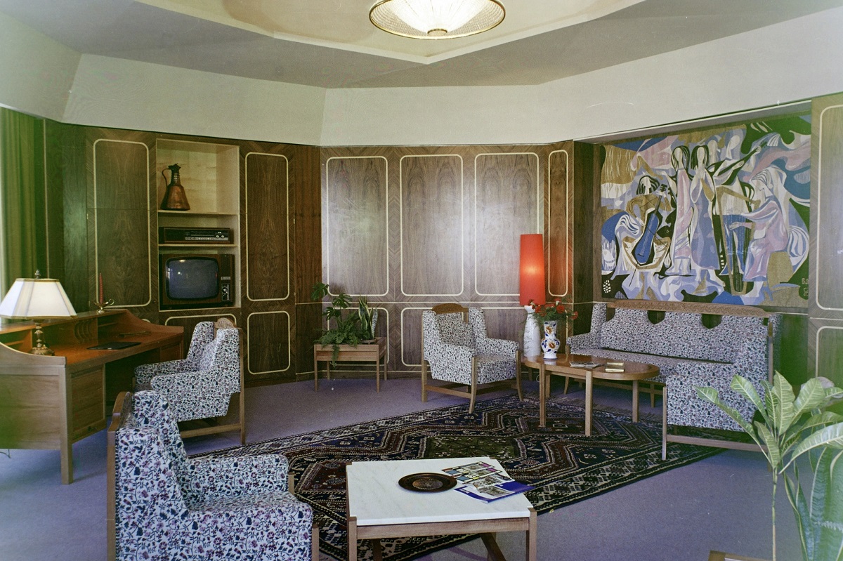
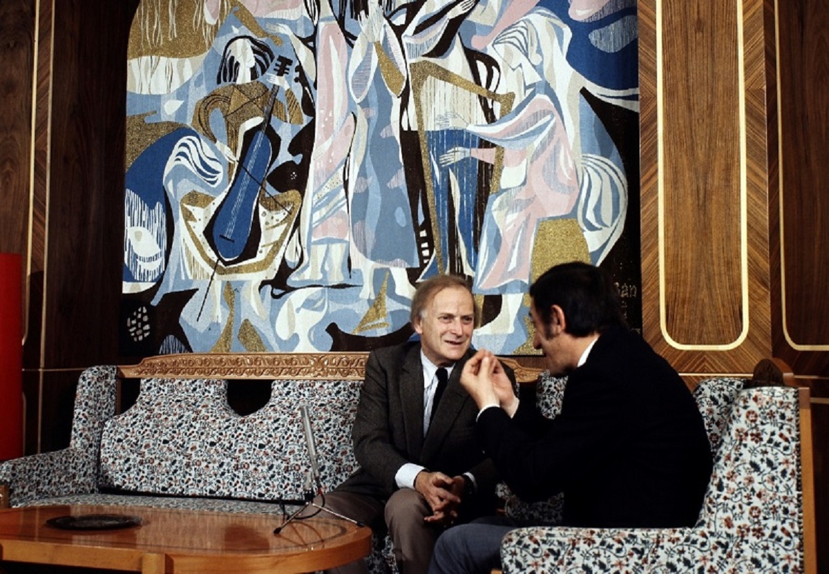
From the gallery level of the foyer, the Tapestry Room opened from a circular lobby. Originally the walls of the lobby were clad in ash – unfortunately the light wood has since been stained to a darker colour, but the elegant proportions and neatly aligned service doors still evoke the 1960s. The Tapestry Room, however, is perhaps the best example of the hotel's architectural character, with its original large oak-panelled arched window boxes and fireplace. The only reminders of the 1960s are a few re-upholstered sofas and a uniform ‘silfid’ radiator cover throughout the building.
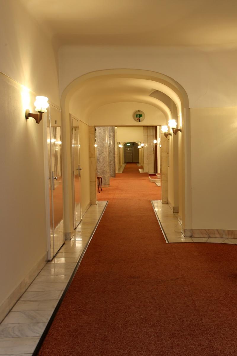
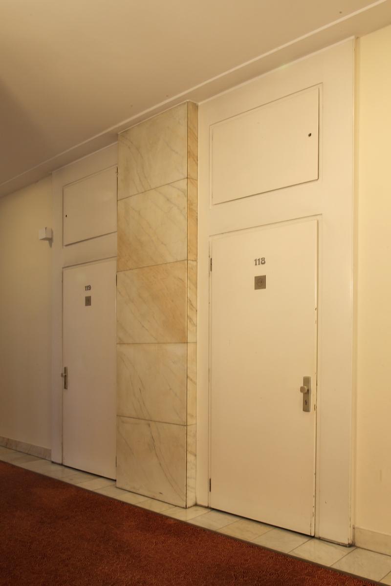
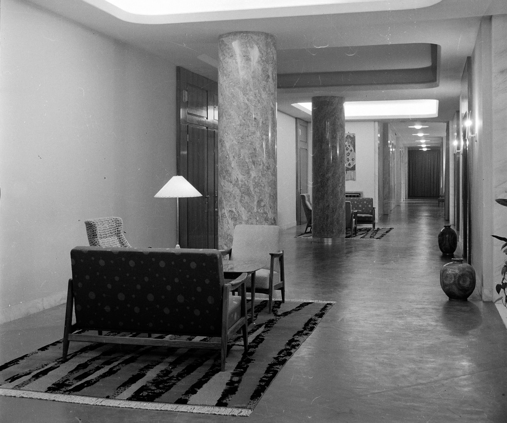
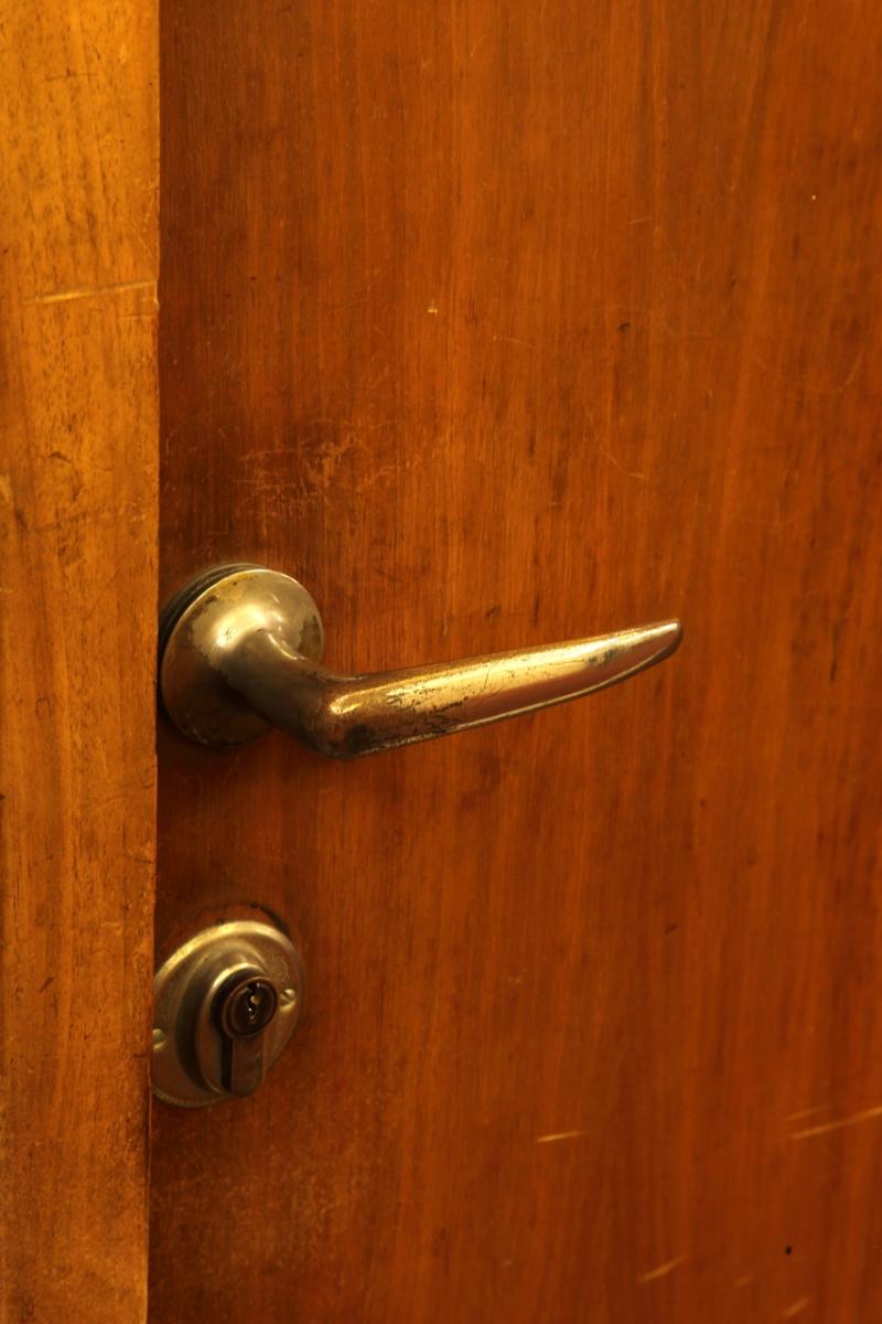
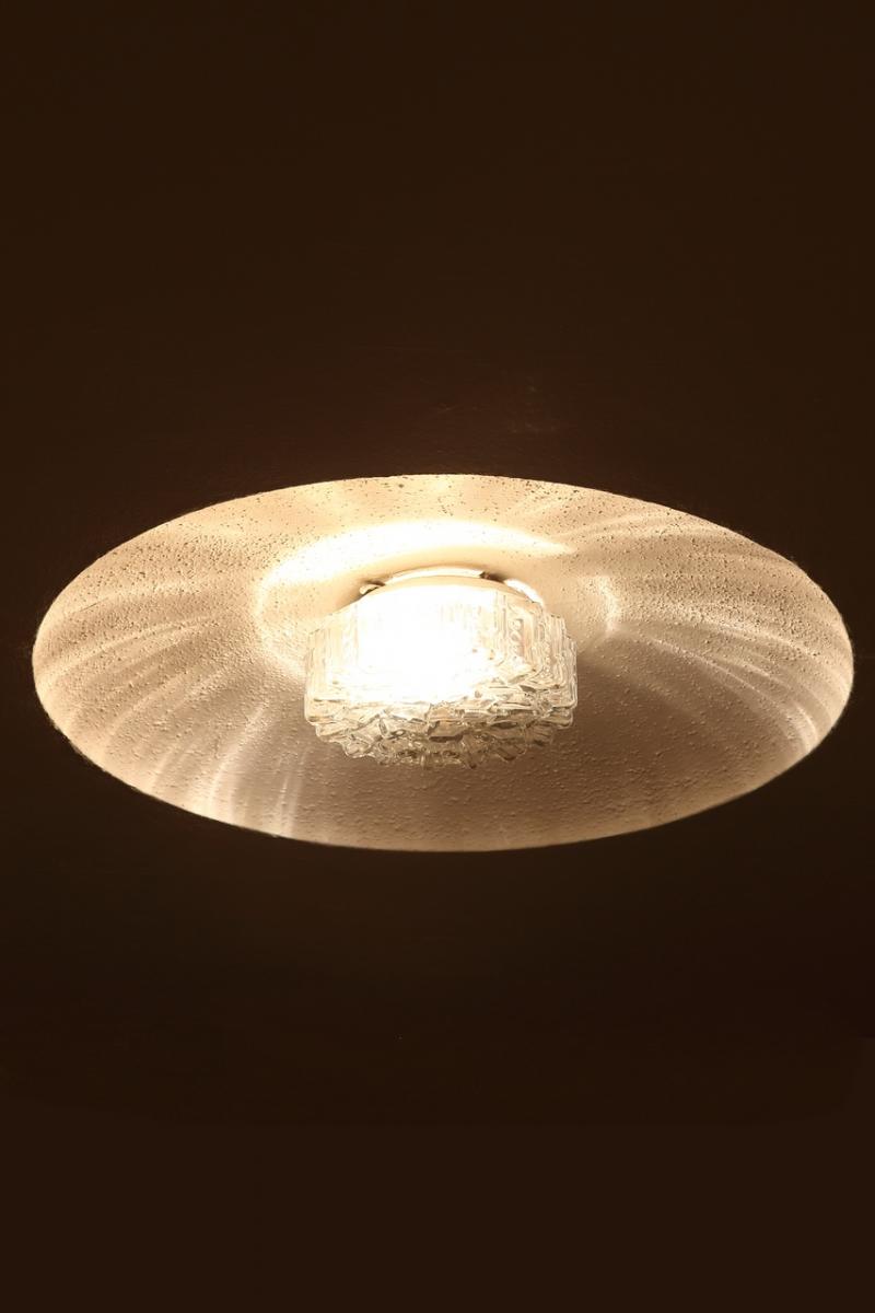
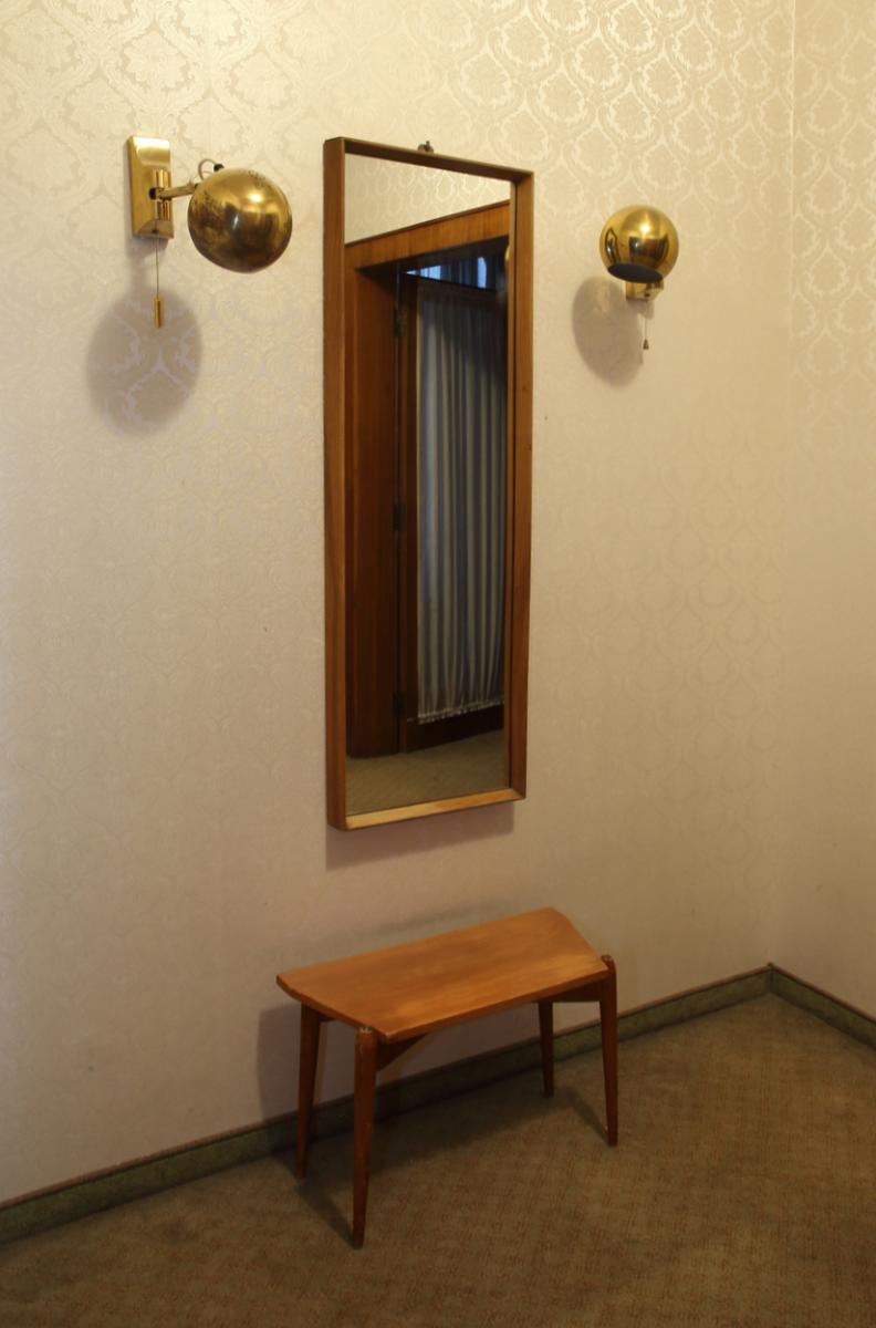
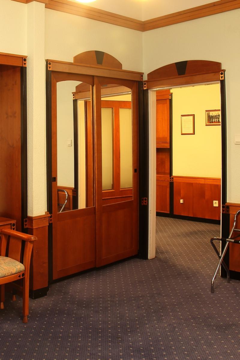
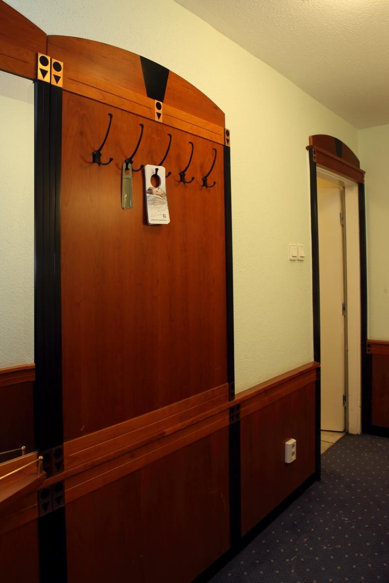
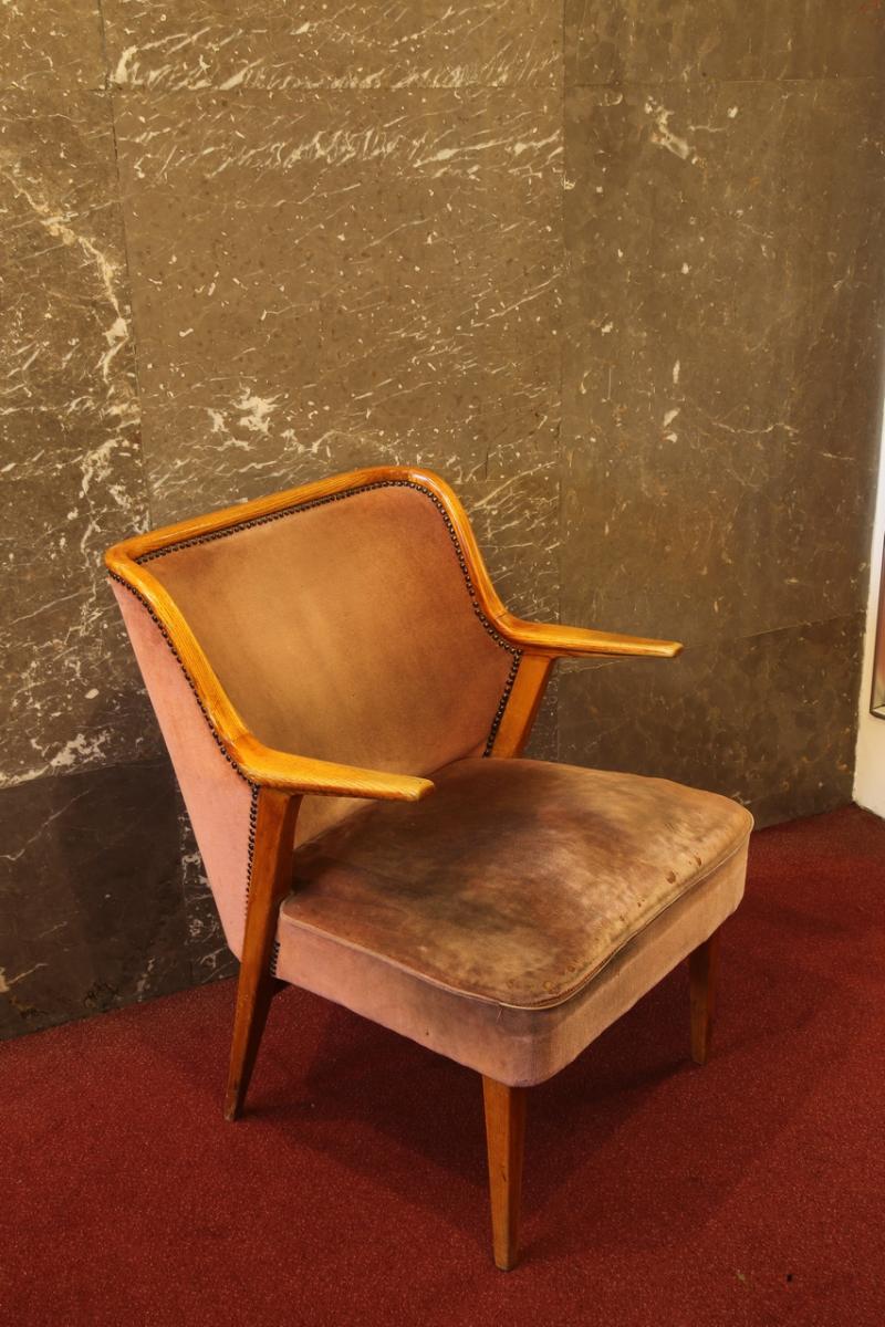
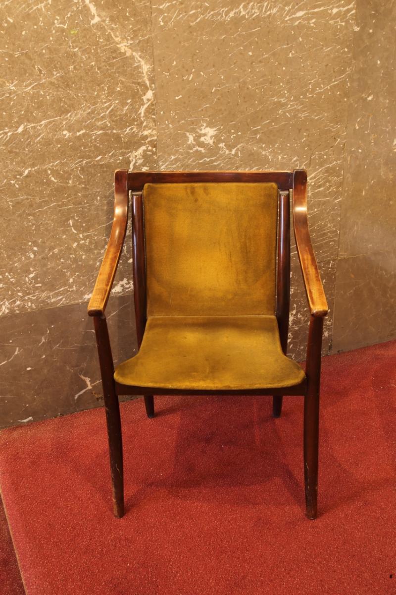
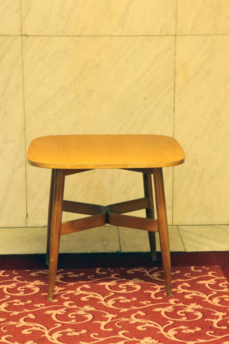
Naturally, we can't leave out the corridors and hallways leading to the rooms. Here, too, there is a sophisticated interior design, unique objects of applied art and pieces of furniture, with Éva Szabó's upholstery designs in special patterns and colours. The ceramics were presumably the work of Géza Gorka, and most of the jute wall textiles were the work of István Bán.
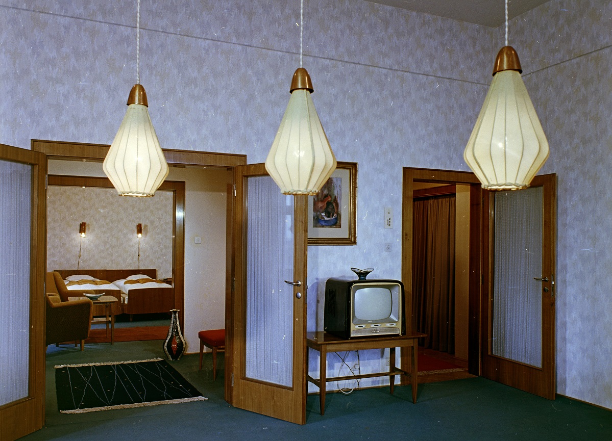
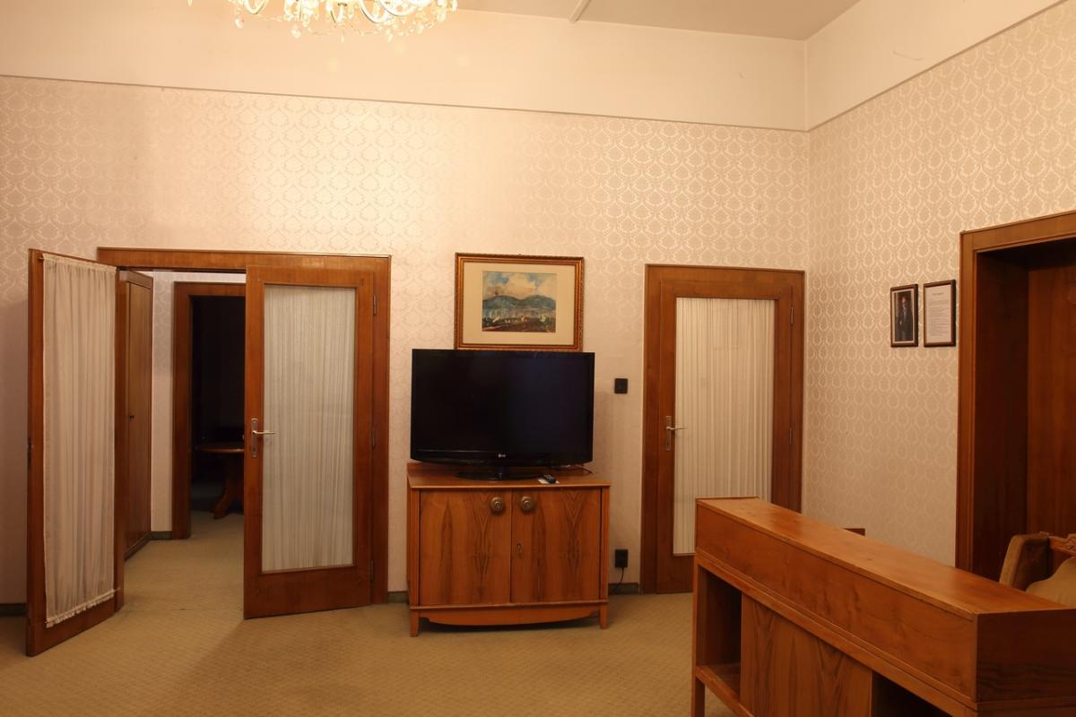
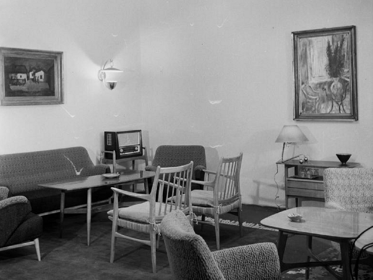
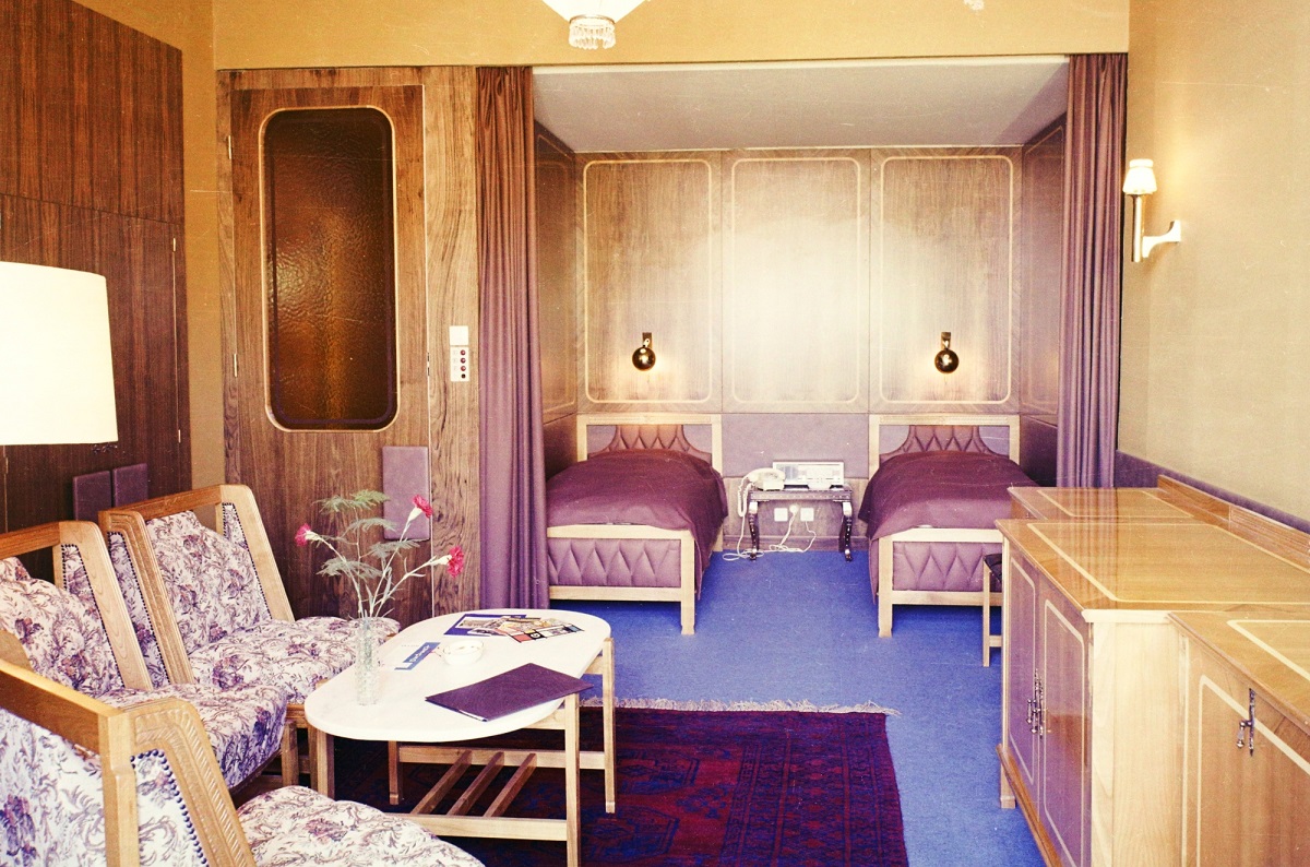
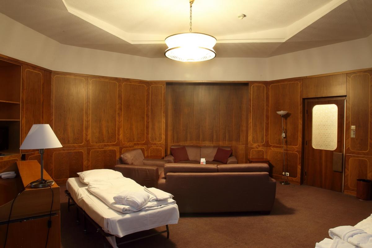
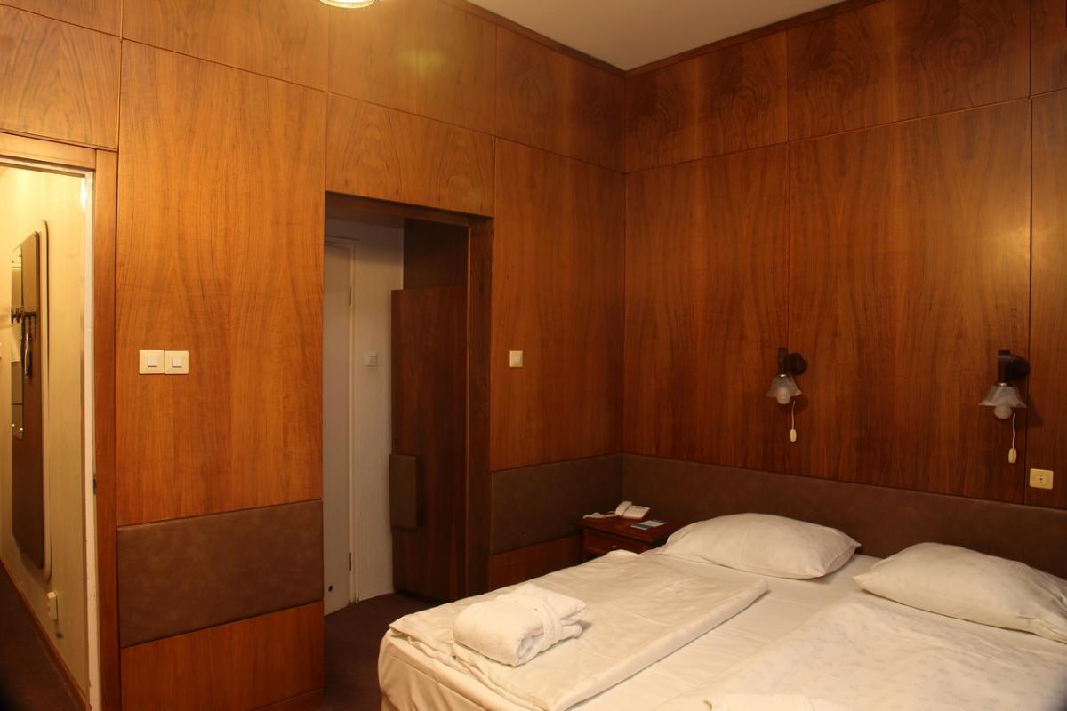
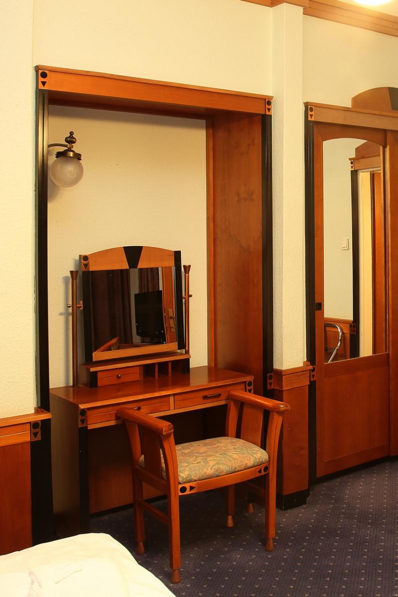
The hotel rooms were furnished by young designers, so they were very different from each other. Some of the rooms had the more conservative, somewhat heavy-handed style of the 1950s, while the lightweight furniture in others evokes the later style of Júlia Gaubek. The rooms were not finished in 1961 either, some still showing the taste of the 70s and 80s in 2021, but of course most of the rooms have since been refurbished. Today, the furnishings are nowhere compatible with the original interior details of the 1960s, but it would be interesting to keep some of the rooms as curiosities in their current state after the upcoming renovation...
GALLERY:
Back to the main page: Virtual Architectural Salvage

